Material Design wipes the slate clean

Android everywhere
This post is excerpted from the Android everywhere series.
Even before its release in 2008, Android’s only constant has been reinvention. What began as a basic operating system for feature phones has exploded into the top mobile platform on the planet, with the industry’s largest touch screens and most extreme hardware capabilities. Android became a diverse and robust ecosystem of smartphones and tablets, with custom designs and features for each distinct manufacturer. The core of Android remained strong, but its influence was waning: as Google iterated its platform with new features and versions, carriers and OEM partners were sloth to adopt. When Google looked to expand Android onto types of devices—like wearables, televisions, and cars—it came time to pull the reins harder.
Android Lollipop represents Google asserting control of its platform, and its intention to bring its singular vision for Android to every connected device in your life. Welcome to Android everywhere.
When Android took the scene on the T-Mobile G1 in 2008, its aesthetic resembled the Google of a bygone era. Software buttons were covered in a gloss and sheen reminiscent of competitors’ devices, icons adopted a strange left-facing orientation, and the OS shipped without an on-screen keyboard, relying on the G1’s slide-out variety instead. Android played nicely with Gmail and allowed for home screen widgets, miniature applications that differentiated the platform immediately from Apple’s locked-down ecosystem. But the operating system was very much in its infancy, and its growth trajectory since has been aggressive. Every future iteration of Android brought features designed to accommodate new types of devices and new carrier partners, with the addition of resolution flexibility in 2.1 Eclair and CDMA network support in 2.2 Froyo. (Android releases, it should be noted, are named after desserts in alphabetical order.) As Android grew to become Apple’s first real competitor on mobile, and as millions of new Android devices were activated every day, Google needed to reshape its platform’s dated image.
The challenge was larger than a new paint job. Because of its openness and willingness to accommodate partners’ priorities, Android as a macroscopic platform had become an inconsistent amalgam of interface ideas and disparate designs. Each Android manufacturer (and, in some cases, each unique handset) boasted interface tweaks or entire skins that diverged from Google’s prescribed designs. This trend was in part because of OEMs’ desire to assert themselves within an increasingly crowded smartphone industry, but also a symptom of Google’s reluctance to wrest control of its platform. With Android 3.0 Honeycomb, the company took a stand: the tablet-only operating system hinted at Google’s new direction by modernizing the home screen interface and replacing the physical buttons for Back, Home, and Menu with on-screen options. Honeycomb launched with the ill-fated Motorola Xoom, but indicated a fresh direction for the search giant: it was conscious of design, and wasn’t going to leave Android’s destiny entirely in manufacturers’ hands.
In 2011, alongside the launch of its Galaxy Nexus flagship, Google unveiled a quantum leap for design on the Android platform with 4.0 Ice Cream Sandwich. Nearly every nook and cranny was revisited under the leadership of Matías Duarte, the new design lead Google nabbed from his work on the forward-thinking webOS team at Palm. Implementing a design aesthetic called “Holo,” Google revised iconography and menus with logical geometric shapes and flat textures. For years, text on stock Android devices had been set in Google’s custom Droid typeface. In Android 4.0, this changed over to another in-house font, Roboto, which was designed to better take advantage of Android devices’ high-resolution displays. But Google’s work was just beginning: because of the Android platform’s troubles with version fragmentation, brought about by sluggish carrier and manufacturer support for new releases, many Android users would need to wait months or years to enjoy Android 4.0 and its successors. Google could design anything they wanted for the top 1% of Android users, but a healthy remainder would have to suffer through version 2.3 for years.
In spring of 2014, Google teased a new realm for Android with Wear, a version of the operating system for smart watches. In the next few months, Android Auto and Android TV entered the fold to take the platform in new mobile and immobile directions. Now, Google needed a design approach that not only worked for legacy devices, but also incorporated the modern thinking for its upcoming ecosystem of hardware form factors. It didn’t have to look far: Google Now, the company’s voice-enabled search and preemptive notification service, featured a gorgeous card-based design philosophy and new ultra-thin fonts. Plus, the app was backwards-compatible with Android devices through a download on the Google Play Store. Although Now’s cards went on to infect interfaces on Android 4.4 KitKat, Google learned a valuable strategy: Android devices didn’t need to be running the latest operating system to take advantage of the latest design ideas. If enough of Google’s core system apps could be updated with new designs, users might feel like they’re running a new OS anyway.
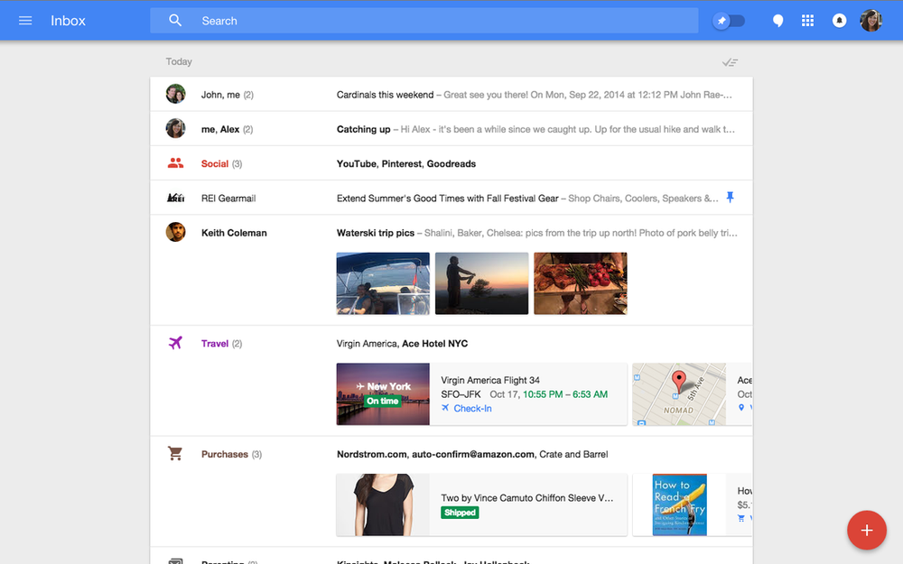
As is common in the technology industry, designs began leaking for a next-generation email interface from Google. Identified by stark blue headers, a slide-out navigation menu, and a curious circular compose button, the “inbox” interface was assumed to be the next iteration of Google’s massively popular Gmail webmail product. (It wound up being an early version of the just-released Google Inbox app, which reinvents how Gmail manages messages.) Leading up to this summer’s Google I/O, the hype surrounding a sweeping redesign was palpable. And as Matías Duarte took the stage to all-too-briefly introduce the future direction of the company’s interface design efforts, the audience cheered: Duarte outlined a uniform system for interfaces, interactivity, and transitional motion that put Android out ahead of even its steepest competition. On the heels of Apple’s iOS 7 redesign, the new design prescription came with a welcome message of consistency and restraint. Google called it “Material Design,” and the framework is poised to reinvent every facet of Android as a platform.
Form, meet function
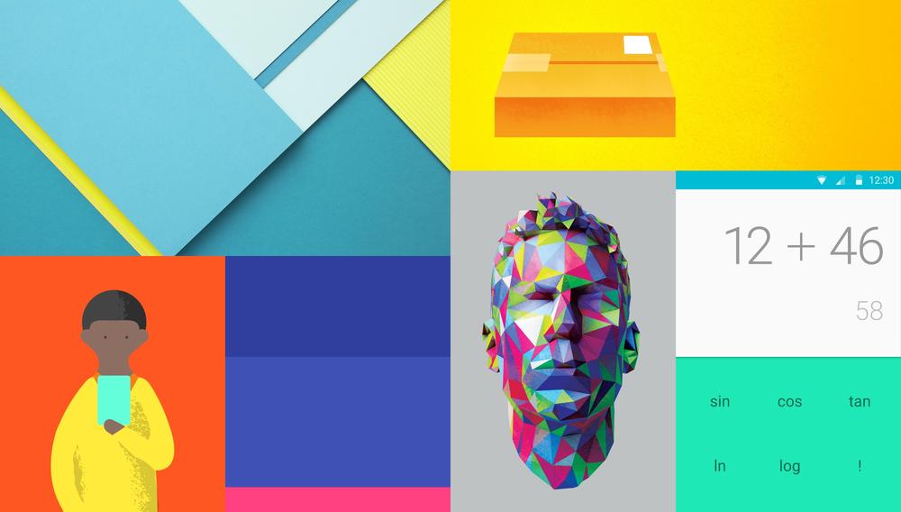
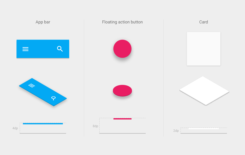
Material Design begins with the addition of “material,” the paper-like layers of interface chrome that populate Android apps. Material exists in three-dimensional space, in functional layers on top of one another. Google outlines the behavior for material within applications in their online design guidelines: material never folds or fades out. It can expand and contract, but cannot pass through other layers of material. Pieces of material have a value defining their placement within a z-axis, meaning developers and designers can determine their stacking and ordering within a particular interface, and the operating system will intelligently apply shadows and depth effects on the fly. Further, Material Design guidelines prescribe a palette of colors and choices for typography, lending Android apps an unprecedented level of consistency and predictability. Now, with a certain degree of customization and personalization, most Android apps will look approximately the same, lowering the barrier to usability for millions of novice users.
Material Design is a comprehensive framework of design elements and philosophies that inform Android application development, both for Google and for third-party developers on the platform. Outlined in an immense 48-page manual on the company’s new design portal, Material Design includes recommendations and templates for everything from modal dialogue windows, sliders, buttons, and even new notification types called “snackbars” and “toasts.” Many designers have highlighted the similarity of Google’s Material Design guidelines to Apple’s Human Interface Guidelines (HIG) for OS X and iOS, which have for years helped Mac and iOS developers design their apps within Apple’s specification. Never before has Google’s design guidance been so informative, deep, and complete. Android application designers have a set of frameworks and initial designs upon which they can base their interfaces, and newcomers to the platform have a new user experience tentpole to cling onto.
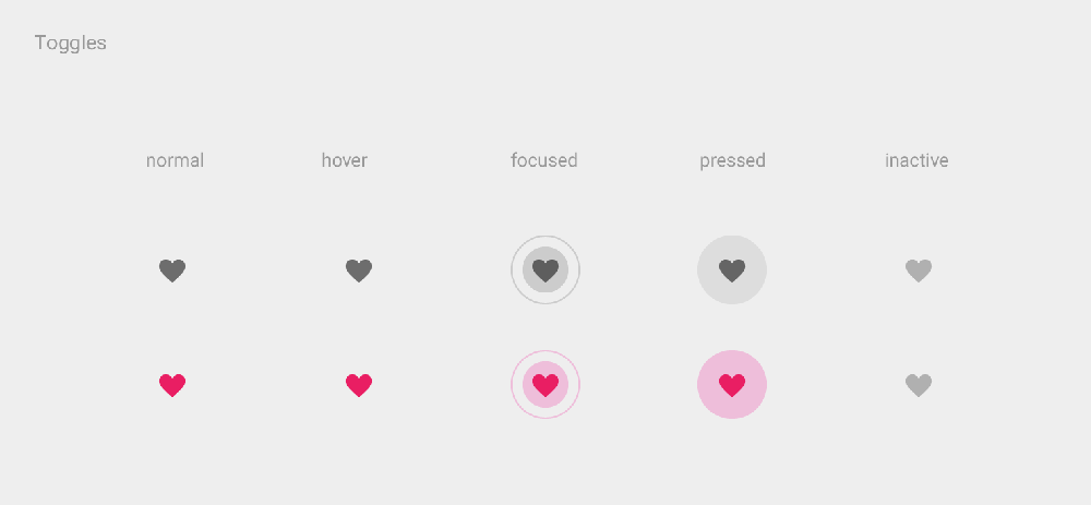
But as Steve Jobs would say, “design isn’t what it looks like. Design is how it works.” Material Design introduces a uniform system for motion and animation within all kinds of Android apps, allowing developers to add effects and transitions within a consistent and beautiful templates. Buttons and menu items respond to user interaction with ripples of color, new windows or modals expand out from the initial point of contact, and menus slide in from off-screen in consistent and predictable ways. These visual flourishes seem minor, but the theme of consistency and universality helps not only users better understand how to interact with their favorite Android apps, but also provides guidance to third-party developers in regards to user interface best practices. The attention to detail and comprehensiveness signifies a new approach for Google, which has previously allowed some flexibility and interpretation for Android user interface design. But the strategy has been a long time coming.
“Project Butter really just smoothed things out, made things a bit faster. Android really needed that at the time. It was a drastic change, and helped Android keep up with iOS in regards to feel and responsiveness.”
With Android 4.1 Jelly Bean in 2012, Google announced a broad-ranging initiate to improve animation quality and fluidity across the operating system. For years, iOS had earned a reputation for its springy animations and silk-smooth scrolling, while Android had been maligned for its lagging responsiveness. With a series of improvements it called “Project Butter,” Google invested in a number of under-the-hood refinements to enhance Android’s visual and touch performance. Among other things, the company included triple-buffering graphics, locked all drawing to a 16-second refresh time, and significantly overhauled the touch input system. The changes improved Android’s reputation for responsiveness, but the operating system still wasn’t quite there: it lacked some of iOS’s visual flourishes that helped make the software seem snappier and more responsive.
“Really, the reason iOS seems so snappy versus Android is in large part because of the transitions. Things can load in the background during transitions, whereas on Android you just see a loading screen. With Material Design, you have transitions that help the OS seem snappier to users.”
First among these was transition animations. On iOS, transitions between applications were marked with lengthy and dramatic transition screens, which obscured the loading process from users. Meanwhile on Android, such visual feedback was avoided in preference for more honest loading screens, which served to slow down the user flow and imply operational slowness relative to iOS. In some cases, Android phones that were significantly more powerful felt slower versus older iPhones because of these animation tricks. With Material Design, Google is moving to standardize a number of interface animations that will help bridge that gap and help Android match its Cupertino competitor in terms of not only actual speed, but apparent speed, as well.
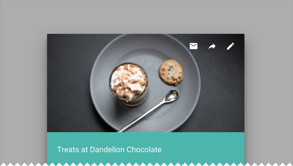
Material Design injects a new level of fluidity and cohesion to Android applications, which will only serve to improve the product experience for Android’s billion customers. The higher degree of polish and the new focus on interface consistency across various aspects of the operating system will help novices and power users alike better understand and interact with their devices. Whereas Android was once an unwashed alternative to iOS in terms of its inconsistent and laissez-faire approach to interface design, Google has begun tightening the reins on its manufacturing partners and prescribing better, more robust guidelines for Android interaction design. Someday, it won’t just be Google’s apps that boast colorful material-centric designs. Material Design will span every aspect of the operating system, and will grow to become an unshakeable part of Google’s overall mobile brand identity.
