Apple Music’s design is broken

Apple’s new streaming service launched to massive hype this summer, bringing a new Beats Music–infused flavor to Apple’s iTunes-centric media ecosystem. Apple Music transforms how Apple approaches media and competes against growing streaming companies like Spotify, and could leave a lasting impression on the music industry with its big-name partnerships and exclusives.
But the service and its apps—the refreshed Music app on iOS and iTunes on desktop–have garnered negative attention for their confusing layouts and bloated feature sets. In the weeks since its June 30 debut, Apple has already begun tweaking how Apple Music works to address some of the major issues, with iOS 9 beta builds and iTunes 12.2.2 already introducing some adjustments.
Apple Music’s successes and failures in user-experience design represent one of the industry’s smartest companies experimenting and pivoting in the market, and their swift changes in direction demonstrate some of the Cupertino giant’s design thinking. Here are some of the biggest lessons we noticed from Apple Music’s early evolutions.
Onboarding is critical.
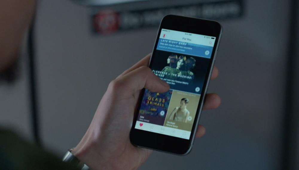
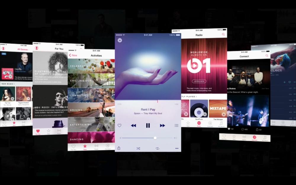
When users first open the Music app after updating to iOS 8.4, they are immediately presented with an all-new design featuring five tabs: For You, New, Radio, Connect, and My Music. The functionality from iOS 8.3 and before, the features that users have become accustomed to, have been collapsed into the My Music tab and now hide behind a singular drop-down view control. The other tabs present newcomers with a sign-up form for a free three-month trial of Apple Music.

One major feature Apple Music inherits from Beats Music is its onboarding flow, which is also one of the experiences that the new Apple Music handles best. When they select the custom-content For You tab, users are prompted to select genres and artists they like from a free-form stack of bubbles. Tapping on an item indicates you like it, double tapping signifies you love it, and holding down “pops” the bubble and eliminates that item from view.
These selections inform all the customized content and recommendations that follow, but represent the strongest and, frankly, only component of Apple Music’s onboarding process. Users are dumped into an interface that does little to explain itself beyond a notification that appears if they select the heart button on a track, album, or playlist.
I’m trapped in Apple Music and no one will help me.
Apple’s approach for familiarizing users with the app and its interface depends on users’ willingness to try poking buttons they don’t understand, and leaves some of Apple Music’s most helpful features buried within obscure menus and deep within complex user paths. For reasons that will become apparent, this reliance on users’ self-determination can only breed more confusion, and more comprehensive onboarding screens or coach marks could help alleviate this concern.
Breadcrumbs matter.
Organizing every song ever recorded is a tough problem, so it should come as no surprise that one of the toughest parts to understand about Apple Music is its navigational structure. Apple’s reliance on a tab navigation for Apple Music, versus a hamburger menu that might be able to contain more options, has made for a confusing interface due to oversimplified and mysteriously named sections.

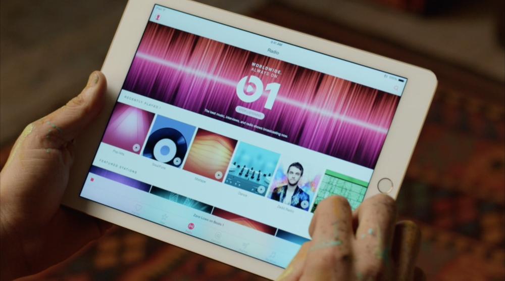
“For You” is a feed of incredibly tailored albums and playlists from Apple Music’s algorithmic recommendations engine and its team of human curators, and represents the unique value of the service. “New” is the home for popular and featured content in the Apple Music library. “Radio” is the home for both Beats 1, the service’s new 24-hour internet radio station, and radio stations based on an artist or genre, à la iTunes Radio in iOS 7 and Pandora before it. “Connect” is a strange artist-centric social network based loosely on iTunes Ping’s troubled legacy, and “My Music” is where purchased music, saved items from the Apple Music library, and playlists of all sorts coexist.
If that sounds confusing to you, you’d be right.
The situation only gets more complicated. A search icon appears on each tab of the app, allowing users to run a search against the Apple Music library from wherever they are. They can add music to their My Music library from wherever they are. They can initiate a radio station from wherever they are. (Simultaneously, the Now Playing screen operates as a layer above these list views, persistent between tabs, and a further menu for Up Next exists above the Now Playing modal. But that’s another problem altogether.)
The root problem is unyielding adherence to five-tab–based navigation, despite dozens of different possible views.
At a certain point, users can have clicked through several levels of content—from a playlist in to an artist in that playlist, to associated artists, to albums by each artist—without the tab navigation changing or showing the path they took to get there. And each tab on Apple Music remembers its state: so as users pop between tabs, they could be a dozen screens deep into a specific artist they were investigating, and the only sign of where they are is a Back button. Breadcrumbs are invisible, leading users to reverse-engineer the path they took to get to any one screen on their own.

The problem of organizing a near-infinite library of content is certainly not unique to Apple Music, but Apple’s insistence on tab-based navigation as the primary navigational structure certainly is. Spotify and Rdio both succumbed to a sidebar menu of available options, allowing them to organize features into buckets numbering more than five. Both Spotify and Rdio also prioritize search as a primary navigational mode, which may be contrary to Apple’s core experience of curation and discovery, but also addresses the problem of massive data sets better.
Contextual menus should be contextual.
One area of unnecessary complexity that Apple is actively correcting are contextual menus, which in iOS 8.4 presented an altogether overwhelming list of possible actions. Songs, albums, artists, and playlists all included ellipsis disclosure buttons that allowed users to take various actions, but the full breadth of possible actions was nothing short of intimidating. Every possible item could be added to the My Music library, added to a playlist, serve as the basis for a new radio station by artist, album, or track, shared with friends, and more.
In iOS 8.4, this menu with its myriad of options essentially took over the screen. In early betas of iOS 9, with the new spacing and typography added to contextual menus, the menu was too large for the screen. Apple quickly course-corrected and offered a condensed and simplified range of options in more recent versions of the iOS 9 beta, demonstrating an awareness of problem areas and a willingness to find a creative solution.

Rather than traditional context menus that present a list of text-based options, the new Apple Music menu includes a fully custom area for actions with additional options. A new section at the top of the menu features album artwork and simple icons for “love” (the service’s on-off mechanic to inform recommendations), radio options, and sharing options. The remaining text-based items never overtake the screen, and vary based on the individual list the item appears within.
Something tells me this app was designed for an iPhone with Force Touch.
These abbreviated menus address the best use-case for contextual menus within an otherwise complicated interface: based entirely on the context of the current view and the item being manipulated, succinct in its possible range of options, and making the most common tasks—liking, sharing, or adding to the user’s My Music library—the most accessible tasks through a custom interface element. While iOS 9’s other interface tweaks might have been the impetus for the menu change, the improvement to such a core component of the Apple Music experience couldn’t have been handled better.
A platform on a platform on a platform.
It goes without saying that Apple Music isn’t Apple’s first music product. The platform builds on a legacy of iTunes products and infrastructure that has served Apple’s millions of iTunes Store customers since 2003, and handles the functional overlaps less than gracefully.
The Apple Music library is not a one-to-one match for the iTunes Store library, due to various licensing and contractual complications. While some users might only worry about not being able to stream The Beatles as part of their Apple Music subscription, the deeper issue is how to surface users’ purchased items while maintaining the context of the My Music library within the broader Apple Music and iTunes libraries.

Users maintain a library of content sourced from both Apple Music—which can be added to the My Music tab from anywhere—and from historical iTunes purchases. (In addition, subscribers to Apple’s iTunes Match service have a library of files uploaded to iCloud from their personal iTunes libraries, which may or may not match up to content included in either the Apple Music or iTunes libraries. But while iTunes Match and Apple Music will coexist for the foreseeable future, these complications are another problem altogether.) This content coexists within the singular My Music tab in the iOS app as part of what Apple calls each user’s iCloud Music Library, and can equally be used to create playlists or radio stations.
This already seems confusing, but it’s about to get a lot worse.
Users can download Apple Music content to their devices for offline playback to their devices, signified by a small phone icon. Conversely, users can leave their purchased iTunes content (or iTunes Match content) stored on the cloud for streaming. Information about where each song is stored, what its original source was, and why any of that matters is completely obfuscated from the user. And the conflation of terms like “My Music,” “iCloud Library,” and “iTunes purchases” don’t help clear up any of the confusion.
Building Apple Music on top of the existing iTunes Store was perhaps a necessary evil, but the way the overlap is handled within the iOS app only creates more confusion. No option exists to obscure traditional iTunes options once a user has subscribed to Apple Music, leaving users feeling like Apple expects them to purchase additional tracks over and above what is ostensibly a $9.99 all-access monthly pass. The business case for keeping iTunes around is apparent, but Google Play Music handles side-by-side store and streaming more gracefully by not stacking all items into one tab within its navigation.
As Apple Music evolves and iTunes services are transformed to fall in line with its streaming-first approach, these problems will resolve themselves. But for the early adopters, the overlap is confusing and wrought with bugs, as users’ long-organized and well curated personal iTunes libraries are infected by mismatched Apple Music metadata. Apple Music is a young service, but it’s built upon one of the industry’s oldest and most bloated platforms in iTunes. Reconciling the two approaches will be difficult, and is likely a process that won’t be complete for several more versions of iOS, but every incremental change will help improve the intuitiveness of Apple’s music offerings.
Despite its early challenges, Apple Music is here to stay, and promises to serve as Apple’s media platform for the next decade.
Despite any UX considerations to be made in future releases, Apple Music is already off to a runaway start, with 11 million subscribers already opted into the service after less than two months. iTunes has been Apple’s media backbone for over a decade, and has already begun passing the baton to Apple Music. All that remains is a television streaming service to complete Apple’s streaming transition.