Apple’s new design style in iOS 10 is a statement on accessibility

When iOS 7 was first previewed to the public at WWDC 2013, it seemed Apple was obsessed with extending its devices’ thinness to its software. Fonts were ultralight, barely legible against semitransparent backgrounds, neon color themes, and bright-white toolbars. Even for an eagle-eyed user, the text and animations made certain apps and screens difficult to read—but for users with accessibility needs, critics argued that it was nearly impossible.
Apple course-corrected some of these design decisions even before iOS 7’s release, swapping the ultralight variant of its Helvetica Neue system font for a more level-headed light option. Over the years, they reined in the most egregious examples of bad accessibility design, introducing a new, more legible font with San Francisco in watchOS and iOS 9, as well as reducing transparency and motion across the operating system.
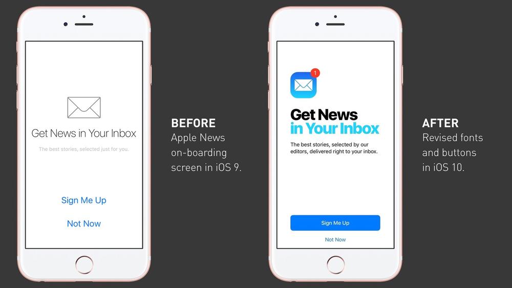
With iOS 10, Apple is taking this refinement several massive steps further, undoing many of the user experience missteps that have plagued the operating system for years. Buttons look like buttons. Fonts and labels are easy to read—and hard to miss. Apple has brought the iOS 7 aesthetic into 2016 in a big way, and has deployed the new style across some of its flagship products and services first. But fonts and buttons seem like little tweaks, not a measured strategic direction. Why do they matter?

A better button to button
Whereas iOS 6 and earlier had relied upon gaudy, glossy buttons modeled after physical objects, buttons in iOS 7 famously looked basically like text labels, yielding countless examples of clickable buttons and static labels that looked indistinguishable from one another when the operating system was first introduced. Over the years, the ongoing need for refinement has brought Apple’s designers to a number of conclusions, including an accessibility option that puts borders around buttons, the prevalence of large-text buttons in on-boarding screens for iOS 9, and increased reliance on iconography rather than labels-and-buttons for common actions.

With iOS 10, buttons are one of the biggest areas of focus and improvement from a user experience perspective. Gone are many examples of text-based buttons, particularly in first-launch on-boarding flows for many common apps and tasks. iOS 10 buttons look like buttons, taking on the tint color of iOS applications and taking a pill-shaped form that replaces the awkward and unclear text-based non-buttons from previous versions. This not only aids in user comprehension but also for developers’ intentionality, allowing preferred or default options to take further precedence over opt-out or “maybe later” options.

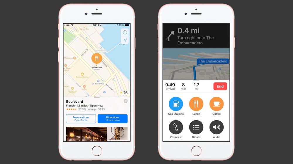
In apps like Maps, the hit targets for buttons that begin or end trips have never been more clear, helping with legibility and ease of tap for users who are likely focused on driving. Objects connected to the user’s iOS device via HomeKit are represented as distinct tiles in both the Home app itself and in the new Home controls within Control Center, helping users understand how to interact with and modify those devices. Apple Music saw one of the biggest overhauls, in part because of the massive UX shortcomings of its first release, which is defined by floating button-shaped objects for playlists and radio stations.

These adjustments represent a new design vocabulary for Apple’s operating systems, relying less on translucency and text elements and reincorporating the object-oriented interface model that earlier versions of iOS relied upon. The term “skeuomorphism,” typically applied to the lavish felt or leather surfaces and extravagant flourishes that populated Apple’s software in iOS 6, actually describes the best practices Apple is implementing here. Distinct cards, like those that Material Design relies upon, are better and more immediately understood by humans than abstract representations of lists, text, and floating images. This is the good sort of skeuomorphic design—not designing a music player that looks and moves like a tape deck, but instead presenting discrete pieces of information as objects that users intuitively know how to engage with.
This is the good sort of skeuomorphic design—apps that don’t look like leather-bound books or tape decks, but that instead give users cues about interactivity though physicality and animation.
A warm font for all mankind
In addition, Apple is evolving their design style across its newest apps—including the redesigned Music, News, and the brand-new Home app—to incorporate bolder fonts, more intuitive navigation, and higher-contrast colors. The aesthetic extends to new labels and icons in the redesigned Control Center, as well as larger, more legible type in the new notifications system. It’s a subtle shift in many places, but its transformation of type is dramatic—so why the changes?
San Francisco was a font custom-designed for Apple’s purposes, starting with watchOS in 2014 and extending to all Apple’s operating systems in 2015. Now, the “black” variant rears its enormous and weighty head, gracing titles and subtitles in apps like News and Music. The new font weights are a stark contrast to the slender fonts that Apple employs across all its other apps, and it marks a strong and confident new personality for the apps that use it.

Fonts are important—they imbue an interface with content and personality. But beyond that, the types of fonts that populate an interface can make the difference between something that’s legible to every user and something that alienates some. Heavy fonts are easier to read, and they’re certainly easier for customers with vision problems to see. But beyond that, these alterations make Apple Music and Apple News subject to users’ settings with Dynamic Type, an accessibility preference that scales the interface depending on the user’s vision capabilities. And this is perhaps the crux of Apple’s new crusade to bulk up and button down parts of iOS 10—these changes ensure that every user can enjoy it.
The crux of Apple’s crusade to bulk up and button down every corner of iOS 10 help ensure that every user can make the most of it.
Accessibility features should be expected
Apple’s devices have always emphasized accessibility, building many features designed for blind or deaf users into the core of its operating systems that other companies ignore. iOS 7 was criticized for its prioritization of form over function, but still included hundreds of accessibility options designed to make iPhones and iPads as useful as possible to the widest array of people.
With iOS 10, Apple recognizes that its commitment to some of its Human Interface Guidelines (HIG) principles might need to be revisited to address the realities of its audience. The iOS user base has always included customers of all ages, and, perhaps better than Android, has appealed to older users looking to break into an accessible and powerful technology. Apple wants everyone to discover its new products, specifically fledgling ones like Apple Music and Apple News, which have seen massive marketing campaigns behind them. With Home on the horizon, it’s begun swapping out slender fonts and unclear buttons for more legible, noticeable, and accessible ones.
Accessibility means more than being compliant with online guidelines and evaluating whether your app is compatible with screen reading technologies. It means rethinking core parts of your app’s branding, personality, and navigation to ensure that it isn’t alienating the users who rely on it. Following Apple’s accessibility guidelines and using core technologies like UIKit can help solve many of these problems out of the box, but apps with customized interfaces will need more effort to optimize for accessibility.
It’s a strategic direction that many interface designers and UX designers should incorporate into their applications. Apple is sure to revisit other apps in coming releases—including text-heavy apps like Phone, Calendar, Weather, and Reminders—and these tweaks will set a new tone for the operating system. If iOS apps of the future want to fit into the personality of iOS, they too should adopt this button-friendly and heavy-font–heavy style. If this is the case, it would seem that while future iPhones might be slimmer, future iPhone apps will be a heck of a lot fatter.