Extend iOS app brand experience to Apple Watch

Apple Watch apps inherit a lot of brand assets from their iOS counterparts, including what can often be years of iterative and hard-fought design decisions that help craft every pixel of an iPhone app interface. Making the transition to Apple Watch, however, can sometimes feel like leaving all of that work and recognition behind. “In some ways, iOS feels so free and open compared to Watch OS,” said Epstein. “But the reality is that both platforms have different ways for branding to shine through. On Apple Watch, designers just need to take advantage of the outlets they do have at their disposal.”
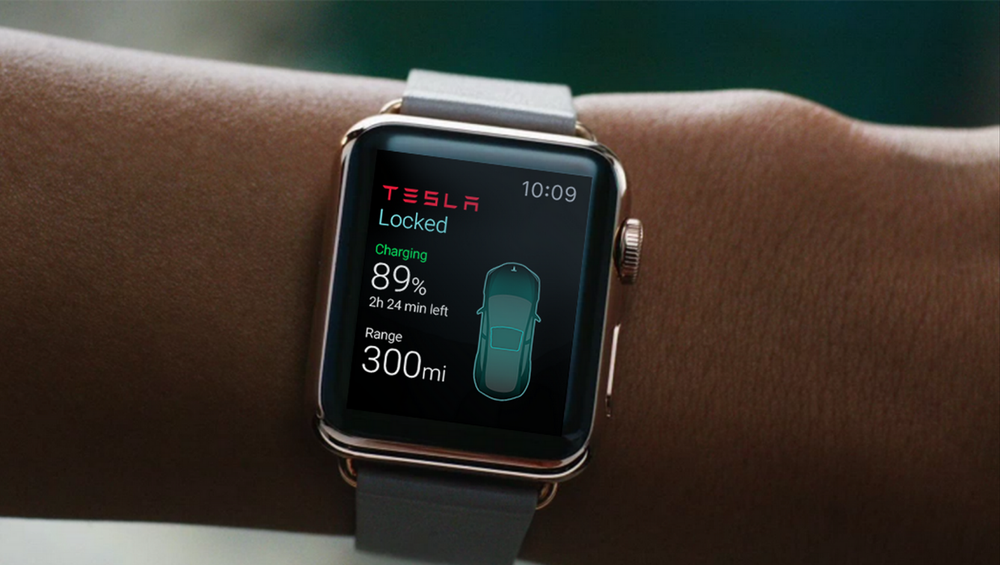
iOS apps can send images to their WatchKit extensions, including unique interface icons and graphical elements for app controls. “You can overcome the ‘standard Watch app’ feel by pulling in unique iconography that reflects the design of the iOS app,” said Epstein. “If you can integrate interesting, illustrative icons that represent your brand, you can make the Watch app much more interesting and memorable for your users.”
Integrate interesting, illustrative icons that represent the brand to make the Watch app much more interesting and memorable for users.
On a more basic level, how can designers bridge the mobile and wearable divide with design? How similar should Watch apps be to the designs of their iOS counterparts, and in what ways should they be different? “In terms of strictly visual design, there needs to be a clear parallel between iOS and Watch with things like color, type, and iconography,” said Epstein. “Since Watch OS is a new platform, you need to give the user visual cues that these two apps are integrated and tied together. The main colors or the app icon might be some of the only customizable options—but that means you should definitely customize them. That’s how you can convey the same visual identity between iOS and Watch OS.”

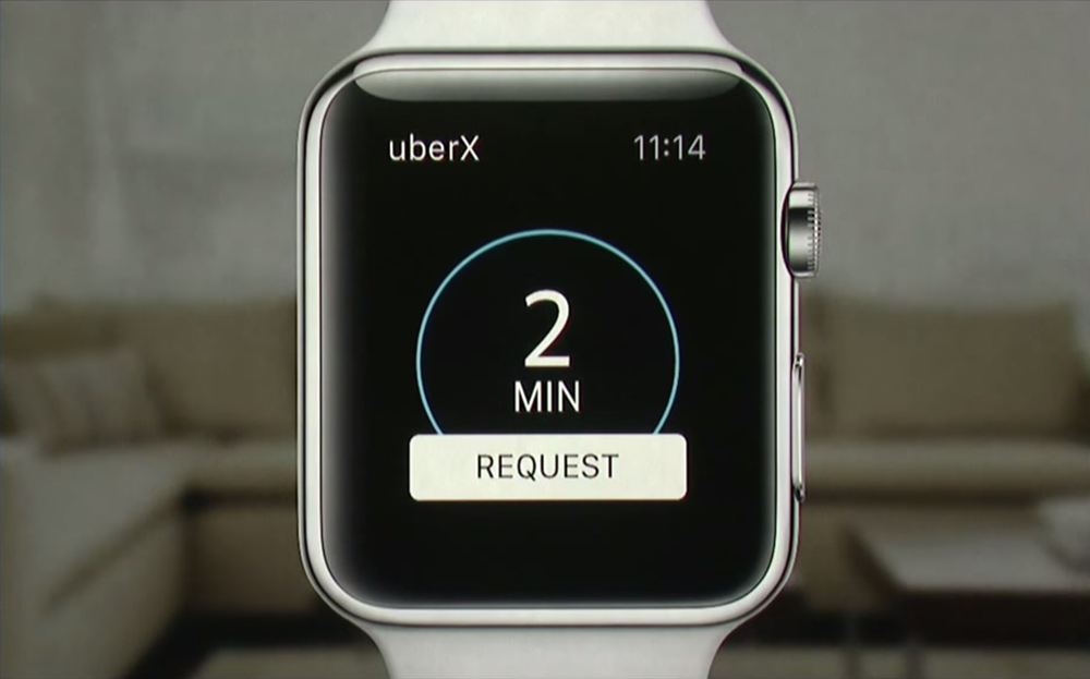
Behind visual design, Epstein has different ideas about what makes a good interface design on Watch OS versus iOS. “I kind of have the opposite opinion when it comes to UX, I guess,” he said. “In terms of features, it’s important to keep in mind that the Watch app shouldn’t simply repeat functionality of the iOS app—because then, what’s the point of the Watch app? It’s crucial that the Watch app do something a bit different, even if that simply means making iOS app features more immediate and seamless. If the Watch app can include new features or functionality that aren’t included in the iOS app, that’s even better.”
Watch apps shouldn’t simply repeat the functionality of iOS apps—because then, what’s the point of the Watch app?
“There needs to be a reason for users to put the Watch app on their wrist, beyond not having to take their phone out of their pocket,” Epstein continued. “The Target iOS app, for example, lets you buy things online from a huge catalog of products. But that user experience doesn’t translate well to Apple Watch. So the Target app’s WatchKit extension lets customers look up individual items and find out where they’re located within the store. That’s a very Watch-specific feature, and it takes advantage of the unique capabilities that Apple Watch brings to the table.”

Apple Watch is a completely new platform, and it requires a completely new approach to interface design and mobile strategy to be truly effective. “The Watch needs to provide something extra,” argues Epstein. “It’s not supposed to be a $600 iPhone accessory, it’s supposed to be something new. UX designers need to really consider what the core function of their iOS app is. What’s that one experience that makes this app valuable to our users? If we removed everything else, what would users expect the app to do for them? That approach will get to the heart of what makes the native app valuable to your users. And then, the Watch app you build can be designed around that one core experience that matters most.”